Easier internationalization (Part 2 of 3)
2024-07-14
The first part of this series was about how many HTML elements are aware of the order and alignment they should be rendered when using specific CSS properties and HTML attributes.
This second part will continue with more CSS properties and values that we can use to make our code "writing direction"-aware, and some layout considerations.
Layout
When defining the layout of a page or the layout of components, I always prefer to use CSS Grid Layout. We already saw how CSS Grid is aware of the direction, but let's see an example more focused on the page layout
Grid Named Areas
CSS Grid is an amazing feature of CSS, it's really versatile and the declarative nature of naming areas is one of my favorite features of it.
When defining a Grid, we can use
the grid-template-areas property
to define a layout where different parts of it
have a clear meaning.
The direction an element is rendered also affects the areas. Check the next CodePen:
See the Pen Grid LTR vs RTL by Ariel Juod (@arieljuod) on CodePen.
Scrollbar Position
Something else that changes when rendering elements in different directions is the position of the scrollbar when the content doesn't fit and the element defines an overflow behavior.
See the Pen Scrollbar position by Ariel Juod (@arieljuod) on CodePen.
Note that the browsers in general won't render the browser's main scrollbar on the left side even if the html is right-to-left if your system is not set as right-to-left too. So you may end up with scrollbars in different places while testing different languages.
Logical CSS Properties and Values
So, now we have the LTR layout, we add the direction: rtl
property as needed and all elements
are now rendered with the new direction, but there's a problem... Let's see an example of the issue in Heroic:
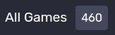
At the top of the Library screen we show this All Games
title and next to it we have a pill with
the total number of games displayed:
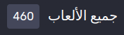
Now we change the language to a RTL
one and you can see the space between the pill and the title
is gone (actually, it is there, but on the wrong side).

Margins and Paddings
To solve this problem, instead of using margin-left, we can use margin-inline-start.
This is called a logical
property that will respect the direction of the element, since start
will have a different
meaning according to the writing direction.
Note that, now, the margin changes from the left to the right side of pill element so we don't have to worry about it:
Some of you may notice that, in this specific case, instead of using a margin we could change it to be a column gap if the parent is a flex box (which it is), a gap will make more sense instead of thinking about margins, but this is the actual current code of Heroic and only meant as an example of the problem. I don't recommend using a margin for this.
Left/Right/Top/Bottom vs Start/End and Inline/Block
Instead of thinking of left/right/up/down, when working with logical properties we have to start thinking about how the element is rendered, where it starts and where it ends, and its writing mode.
In the default horizontal and left to right writing we can think of them like this:
margin-inline-startis equivalent tomargin-leftmargin-inline-endis equivalent tomargin-rightmargin-block-startis equivalent tomargin-topmargin-block-endis equivalent tomargin-bottom
The same concept applies for paddings.
Note that using themarginshorthand property will set the top/right/bottom/left margins and not the logical ones, so be careful with it. You can use the shorthandmargin-inlineandmargin-blockproperties instead.
Inline vs Block
The inline
properties are applied in the direction the text is written, while the block
properties
are applied in the direction the new lines are added. So, in a vertical writing mode, the
block
properties
will actually be left and right instead of top and bottom!.
Alignment Inside Grid and Flex
When we want to align elements inside a Flex container or inside each cell of a CSS Grid, we use the
align-items/content-self
and justify-items/content/self
properties. Similar to margins and paddings,
instead of using left
or right
values we can use the start
and end
ones to make them respect the direction.
Inline vs Block
The align-*
properties align the element/s in the block
direction (vertical direction with the default
horizontal left to right). And the justify-*
properties are used to align the element/s in the inline
direction (horizontal in the default setup).
Absolute Position
Sometimes we have to position elements using position: absolute
and we typically set a predefined
position we want an element to be inside its parent using top/right/bottom/left properties. But we can
also use logical properties to make absolute positioning aware of the direction and writing mode of components.
Instead of top
we can use inset-block-start, instead of left
we can use inset-inline-start
(you can guess the other sides). Check this working example:
See the Pen Logical position absolute by Ariel Juod (@arieljuod) on CodePen.
Conclusion
This is just a sample of all the logical properties and values in CSS. There are more and in general they work in similar ways:
-
Borders can be defined logically (as in
border-topcan be replaced withborder-block-start) -
block-sizeandinline-sizecan be used to replaceheightandwidth -
max-block-sizeandmin-block-sizecan be used to replacemax-heightandmin-height -
overflow-blockis still not supported, but would be an alternative tooverflow-y - And many more
What I want to demonstrate here is how we can leverage logical properties to make our lives easier in the future. Even if we don't know if the application will ever need to support languages other than left-to-right, if we write our CSS with logical properties when it makes sense, we'll just get most of the work ready, and we'll only need to define the direction and writing-mode.
One last thing (this is getting really long), you can use a linter to check your CSS and flag when logical properties could be used. This Stylelint plugin is a good example.
What's next?
The next article in this series will probably be the last one related to i18n for a while, and I'll focus on more obscure problems we had to deal with in Heroic and other projects I've worked with in the past.